Demo 15: Styling with Bootstrap
In this demonstration, I will show how to use the popular front-end component library, Bootstrap, to make pages that are stylish and modern looking. We will continue to build upon the QuizMe project from the previous demos.
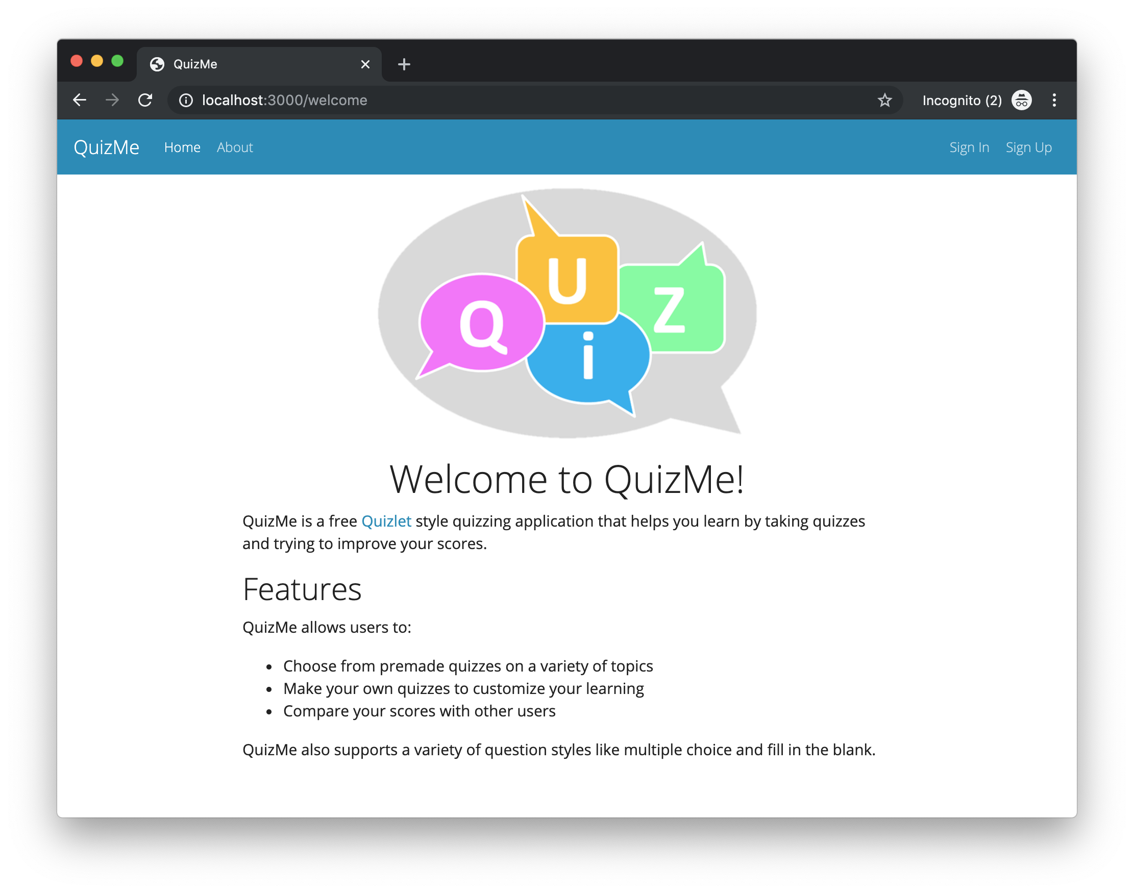
In particular, we will use Bootstrap components in combination with a Bootswatch theme to customize the style (e.g., fonts, colors, text alignment, and layout) of our current pages, and we will add a Bootstrap navbar (short for navigation bar), as depicted in Figure 1.
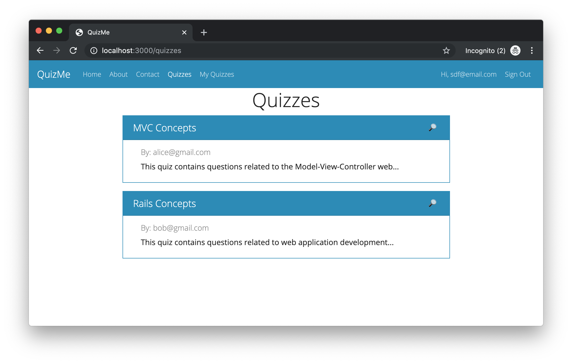
We will also use Bootstrap cards to display Quiz records, as depicted in Figure 2.
index page for Quiz records that now uses Bootstrap cards to display each quiz record.Finally, we will use Bootstrap alerts to style our form notifications, and we will annotate form fields with error messages, as depicted in Figure 3.
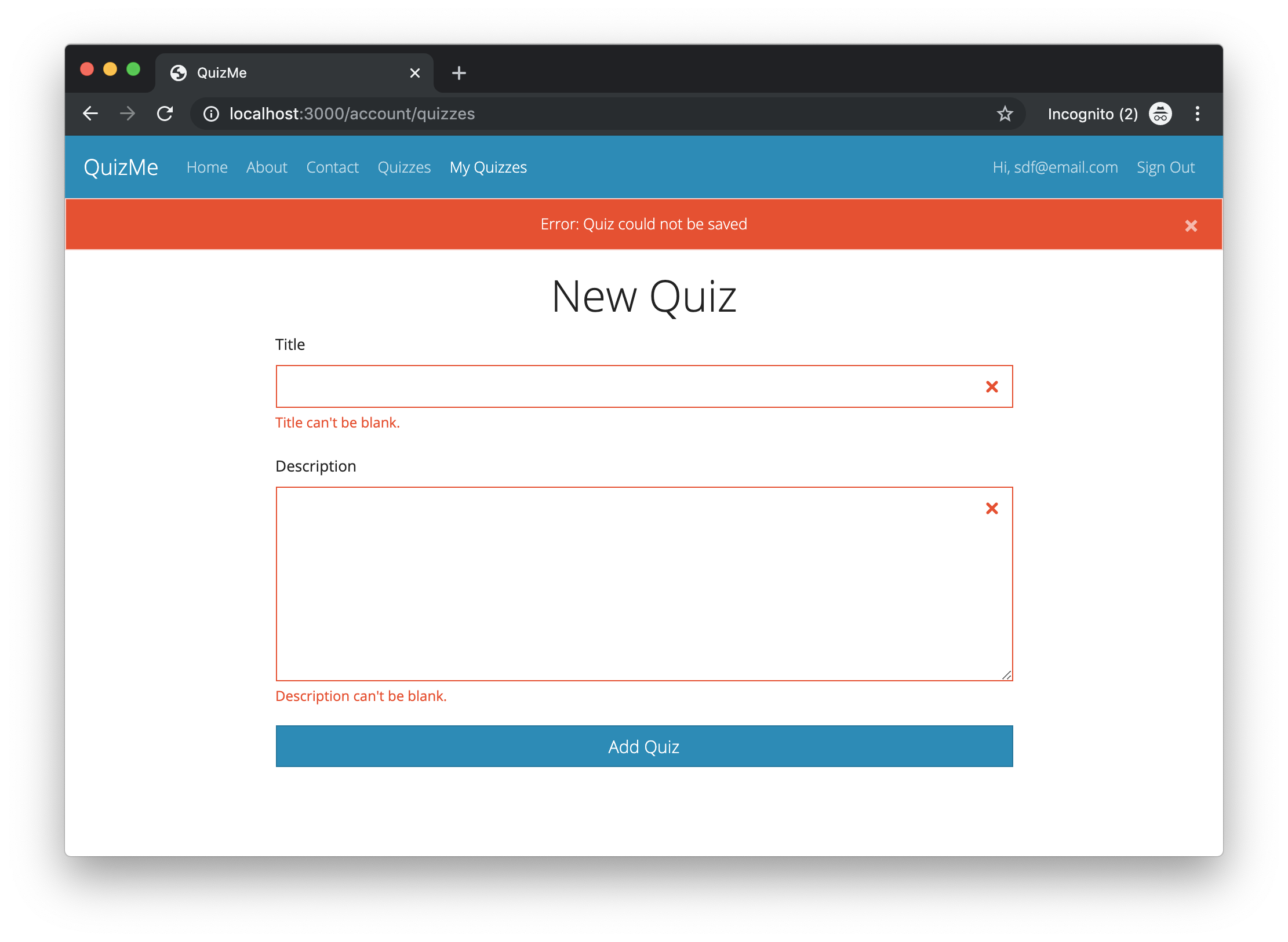
Quiz records that now uses Bootstrap to style notice/alert messages and now annotates form fields with error messages.1. Installing Bootstrap
Note to COMP 4018 students: This task has already been done in your project repo, so you can start using it immediately.
-
Add some Yarn packages to the project, including Bootstrap and its dependencies, by running the console command:
yarn add bootstrap jquery popper.js expose-loader bootswatch jquery-ui autosizeIn particular, the
bootstraplibrary requiresjqueryandpopper.js. We are installingbootswatchto conveniently choose from a selection Bootstrap-based themes.expose-loaderenables the use of JQuery in views.jquery-uihas some nice features (e.g., thepositionmethod).autosizeenables automatically scaling the height of atextareato fit its content. -
Webpacker is a Rails subsystem for managing JavaScript in Rails. Configure Webpacker by inserting the following code on line 2 of the file,
config/webpack/environment.js:const webpack = require("webpack") environment.plugins.append("Provide", new webpack.ProvidePlugin({ $: 'jquery', jQuery: 'jquery', "window.jQuery": "jquery'", "window.$": "jquery", Popper: ['popper.js', 'default'] })) environment.config.merge({ module: { rules: [ { test: require.resolve('jquery'), use: [{ loader: 'expose-loader', options: '$' }, { loader: 'expose-loader', options: 'jQuery' }] }, { test: require.resolve('@rails/ujs'), use: [{ loader: 'expose-loader', options: 'Rails' }] } ] } }) -
Add the following to the bottom of
app/javascript/packs/application.js:import 'bootstrap' import { autosize } from 'autosize' document.addEventListener("turbolinks:load", () => { $('[data-toggle="tooltip"]').tooltip() $('[data-toggle="popover"]').popover() }) -
Rename the file,
app/assets/stylesheets/application.css, to beapplication.scss(note the extrasin the file extension). -
Import the Bootstrap CSS classes by adding the following to
application.scss:@import "../node_modules/bootstrap/scss/bootstrap";If you reload the QuizMe app now, you should see the fonts have changed.
2. Adding a Bootswatch Theme
Bootswatch themes override the default colors, font, sizing, and look of the default Bootstrap classes. You can find a list of the available themes (including examples) on the Bootswatch website. For the QuizMe project, we will use the Yeti theme.
-
Add the Yeti theme by importing the styles in
application.scss, like this:@import "../node_modules/bootswatch/dist/yeti/variables"; @import "../node_modules/bootstrap/scss/bootstrap"; @import "../node_modules/bootswatch/dist/yeti/bootswatch";You can change which theme is used by replacing “
yeti” with the theme name you want.Once the theme has been added, you can reload the page to see the text styling has changed again.
3. Adding a Navbar
3.1. Migrating the Old Navigation Links into a Navbar
For this task, we will convert the existing list of links at the top of our pages (i.e., the ones in the ul element) into a more modern and practical Bootstrap navbar. In particular, we will start with the Yeti navbar templates (provided here) and customize the template code to have the correct links.
-
Paste in the Yeti navbar template, like this:
<nav class="navbar navbar-expand-lg navbar-dark bg-primary"> <a class="navbar-brand" href="#">Navbar</a> <button class="navbar-toggler" type="button" data-toggle="collapse" data-target="#navbarColor01" aria-controls="navbarColor01" aria-expanded="false" aria-label="Toggle navigation"> <span class="navbar-toggler-icon"></span> </button> <div class="collapse navbar-collapse" id="navbarColor01"> <ul class="navbar-nav mr-auto"> <li class="nav-item active"> <a class="nav-link" href="#">Home <span class="sr-only">(current)</span></a> </li> <li class="nav-item"> <a class="nav-link" href="#">Features</a> </li> <li class="nav-item"> <a class="nav-link" href="#">Pricing</a> </li> <li class="nav-item"> <a class="nav-link" href="#">About</a> </li> </ul> <form class="form-inline my-2 my-lg-0"> <input class="form-control mr-sm-2" type="text" placeholder="Search"> <button class="btn btn-secondary my-2 my-sm-0" type="submit">Search</button> </form> </div> </nav> -
Change the
navbar-brandelement to QuizMe, like this:<a class="navbar-brand" href="#">QuizMe</a> -
Replace the links in the template’s
ulelement with our actual Home, About, etc. links, like this:<ul class="navbar-nav mr-auto"> <li class="nav-item active"> <%= link_to 'Home', root_path, class: 'nav-link' %> </li> <li class="nav-item"> <%= link_to 'About', about_path, class: 'nav-link' %> </li> <li class="nav-item"> <%= link_to 'Contact', contact_path, class: 'nav-link' %> </li> <% if user_signed_in? %> <li class="nav-item"> <%= link_to 'Quizzes', quizzes_path, class: 'nav-link' %> </li> <li class="nav-item"> <%= link_to 'My Quizzes', account_quizzes_path, class: 'nav-link' %> </li> <% end %> </ul> -
Replace the template’s
formelement with anotherulelement that contains the Devise links, like this:<ul class="navbar-nav"> <% if user_signed_in? %> <li class="nav-item"> <%= link_to "Hi, #{current_user.email}", edit_user_registration_path, class: 'nav-link' %> </li> <li class="nav-item"> <%= link_to 'Sign Out', destroy_user_session_path, method: :delete, class: 'nav-link' %> </li> <% else %> <li class="nav-item"> <%= link_to 'Sign In', new_user_session_path, class: 'nav-link' %> </li> <li class="nav-item"> <%= link_to 'Sign Up', new_user_registration_path, class: 'nav-link' %> </li> <% end %> </ul>
3.2. Conditionally Highlighting the Active Navigation Link
In the above code, the nav-item element for the Home link has an additional active class; however, this is incorrect and needs to be fixed. The intent of the active class is to highlight the nav link for the currently open page. However, to achieve this behavior, the active class must be applied to the nav-item element that corresponds to the current page. The above code is broken in that the Home nav-item element is always styled as active regardless of which page is actually open.
To fix this problem, we will conditionally add the active class to the appropriate nav-item element for the current page by making the following changes.
-
Add a helper method
active_classtoapplication_helper.rbthat returns the string “active” if the path of the current HTTP request matches apathparameter and that otherwise return an empty string, like this:def active_class(path) if request.path == path return 'active' else return '' end end -
Use this helper method in the navbar view code to add the
activeclass to the appropriatenav-itemelement, like this:<ul class="navbar-nav mr-auto"> <li class="nav-item <%= active_class(welcome_path) %>"> <%= link_to 'Home', welcome_path, class: 'nav-link' %> </li> <li class="nav-item <%= active_class(about_path) %>"> <%= link_to 'About', about_path, class: 'nav-link' %> </li> <% if user_signed_in? %> <li class="nav-item <%= active_class(contact_path) %>"> <%= link_to 'Contact', contact_path, class: 'nav-link' %> </li> <li class="nav-item <%= active_class(quizzes_path) %>"> <%= link_to 'Quizzes', quizzes_path, class: 'nav-link' %> </li> <li class="nav-item <%= active_class(account_quizzes_path) %>"> <%= link_to 'My Quizzes', account_quizzes_path, class: 'nav-link' %> </li> <% end %> </ul> <ul class="navbar-nav"> <% if user_signed_in? %> <li class="nav-item <%= active_class(edit_user_registration_path) %>"> <%= link_to "Hi, #{current_user.email}", edit_user_registration_path, class: 'nav-link' %> </li> <li class="nav-item <%= active_class(destroy_user_session_path) %>"> <%= link_to 'Sign Out', destroy_user_session_path, method: :delete, class: 'nav-link' %> </li> <% else %> <li class="nav-item <%= active_class(new_user_session_path) %>"> <%= link_to 'Sign In', new_user_session_path, class: 'nav-link' %> </li> <li class="nav-item <%= active_class(new_user_registration_path) %>"> <%= link_to 'Sign Up', new_user_registration_path, class: 'nav-link' %> </li> <% end %> </ul>
4. Centering Content
For this task, we will center several different types of elements on our pages.
4.1. Centering a Text Element
One element that we would like to center is the h1 text-heading elements on all our pages.
-
To center an individual
h1element, we could add the Bootstraptext-centerclass, like this:<h1 class="text-center">Welcome to QuizMe!</h1>However, this class must be applied to individual elements, which would not be a very DRY way to apply the style, considering that we want to center all
h1elements on all pages. -
Instead of individually styling each individual
h1element with thetext-centerclass, we will instead set a globaltext-alignstyle for allh1elements by adding some CSS toapplication.scss, like this:h1 { text-align: center; }This global style will center the heading text for all
h1elements on every page in the app.
4.2. Centering an Element with Margin
Another element that we would like to center on the page is the QuizMe welcome-page image; however, we can’t use the text-align style like we did for the h1 heading elements, because the style only works for text elements. To horizontally center elements that don’t contain text, we can use the Bootstrap mx-auto class. This class divides the empty whitespace around the element between the element’s left and right margins, centering the element within its parent element.
-
Center the welcome-page image by making the
imgelement a block-level element (using the Bootstrapd-blockclass) and by adding the.mx-autoclass, like this:<%= image_tag "quiz-bubble.png", width: 400, class: 'd-block mx-auto' %>
4.3. Centering with Columns and Justify Content
A final sort of element centering that we would like to do is to make the content of each page layout in a column such that the column is placed in the center (horizontally speaking) of the page. To accomplish this task, we will leverage Bootstrap’s 12-column flexbox grid layout system. For most of the pages in QuizMe, we don’t want multiple columns side-by-side, but we do want the content to be somewhat in the middle of the page with margins on both sides. We can achieve this by creating a single column that spans 8 of the 12 possible Bootstrap columns, and then, by centering the entire column on the page (leaving the width of 2 columns on each side).
-
To achieve this layout, wrap the
yieldstatement inapplication.html.erbin a 3-layerdivwrapper with the outermostdivhaving the Bootstrapcontainer-fluidclass, the seconddivhaving the Bootstraprowandjustify-content-centerclasses, and the innermostdivhaving the Bootstrapcol-8class, like this:<div class="container-fluid"> <div class="row justify-content-center"> <div class="col-8"> <%= yield %> </div> </div> </div>
5. Displaying Records as Bootstrap Cards
In this task, we will restyle the quizzes displayed on the index page for Quiz records by displaying each quiz as a Bootstrap card, as shown in Figure 2.
-
Put each quiz in the
quizzes/index.html.erbview into a card container, like this:<div id="<%= dom_id(quiz) %>"> <div class="card container border-primary mb-3"> <div class="card-header row justify-content-between text-white bg-primary"> <h5 class='m-0'><%= quiz.title %></h5> <div> <%= link_to '🔎', quiz_path(quiz) %> <% if quiz.creator == current_user %> <%= link_to '🖋', edit_quiz_path(quiz) %> <%= link_to '🗑', quiz_path(quiz), method: :delete %> <% end %> </div> </div> <div class="card-body"> <h6 class="card-subtitle mb-2 text-muted">By: <%= quiz.creator.email %></h6> <p class="card-text"><%= truncate quiz.description, length: 75, separator: ' ' %></p> </div> </div> </div>
6. Adding Flash Key Colors
In this task, we will apply a flashier Bootstrap style to our flash messages (as depicted in Figure 3). In Bootstrap, flash messages are typically styled with the alert class along with one of the colored alert-x classes, such as alert-success (usually green) or alert-danger (usually red).
-
To automatically set the
alertclass based on the key used for the message, add aflash_classhelper method that maps all flash key values used in the app to an appropriatealertclass, like this:def flash_class(level) bootstrap_alert_class = { "success" => "alert-success", "error" => "alert-danger", "notice" => "alert-info", "alert" => "alert-danger", "warn" => "alert-warning" } bootstrap_alert_class[level] endMore keys can be added later if necessary. A list of all the
alertclasses can be found here. If a Bootswatch theme has been applied, the colors of each alert class will be different depending on the theme. -
In the view layout
layouts/application.html.erb, update the existing flash message code to use the Bootstrapalertclass and theflash_classhelper method, like this:<% flash.each do |key, message| %> <div class="alert <%= flash_class(key) %> alert-dismissible fade show text-center" role="alert"> <%= message %> <button type="button" class="close" data-dismiss="alert" aria-label="Close"> <span aria-hidden="true">×</span> </button> </div> <% end %> -
The above code has a little problem: the
alerttext is slightly off-center. Fix this by adding the following toapplication.scss:.alert-dismissible { padding-left: $close-font-size + $alert-padding-x * 2; }These variables were declared in the Bootstrap files in the
node_modulesfolder, but we can use them in our SCSS files after theimportstatement.
7. Styling Forms That Display Errors
In this final task, we will use the Bootstrap form classes to make the app’s form fields look nicer. Then, we will add attribute-specific error messages and coloring to the form fields to make it clearer to the user what errors they need to fix in their input (as depicted in Figure 3).
7.1. Applying Bootstrap Form Classes
Styling forms using the Bootstrap form classes can be accomplished as follows. Each div that contains a label and a field element should have the form-group class. Each field element should have the form-control class. The submit button should have the btn class, and probably one or more of the special button-styling classes, such as btn-primary for color or btn-block for a full-width button.
-
Add the appropriate Bootstrap form classes to the
account_quizzes/new.html.erbview, like this:<div class="form-group"> <%= form.label :title %> <%= form.text_field :title, class: "form-control" %> </div> <div class="form-group"> <%= form.label :description %> <%= form.text_area :description, size: "27x7", class: "form-control" %> </div> <%= form.submit "Add Quiz", class: "btn btn-block btn-primary" %>Notice that we no longer need the
brelements between the labels and fields.
7.2. Adding Field-Specific Error Messages
When a Rails model validation fails, Rails adds a description of the error to an errors hash that is part of the model object. We can determine if an object is invalid (i.e., has any validation errors) by checking if the errors hash is empty. We can also get the errors for a particular attribute using a key-based lookup in the errors hash.
-
Before each
form-groupdiv, add abooleanvariable that holds whether there are errors for the corresponding attribute, like this code for thetitleattribute:<% invalid = quiz.errors.include?(:title) %> -
Use the
invalidvariable to conditionally add theis-invalidclass to the field element if there are any errors for the attribute, like this code for thetitleattribute:<%= form.text_field :title, class: "form-control #{'is-invalid' if invalid}" %> -
Display the error messages for the attribute (if there are any) by conditionally inserting a
divwith the error message after the field element, like this code for thetitleattribute:<% if invalid %> <div class="invalid-feedback d-block"> <% quiz.errors.full_messages_for(:title).each do |error_message| %> <%= error_message %>. <% end %> </div> <% end %>
The preceding steps should be followed for each form field such that each on looks similar to this:
<% invalid = quiz.errors.include?(:title) %>
<div class="form-group">
<%= form.label :title %>
<%= form.text_field :title, class: "form-control #{'is-invalid' if invalid}" %>
 <% if invalid %>
   <div class="invalid-feedback d-block">
     <% quiz.errors.full_messages_for(:title).each do |error_message| %>
       <%= error_message %>.
     <% end %>
   </div>
 <% end %>
</div>
We should now be able to submit invalid quiz data and to see the field-specific error messages.